For our second to last milestone of Project Beta, we had to present for review in a formal presentation, our complete playable build and themed artwork. This included an updated Art Bible which would also be viewed in the presentation by an external industry representative a week before the final hand-in.
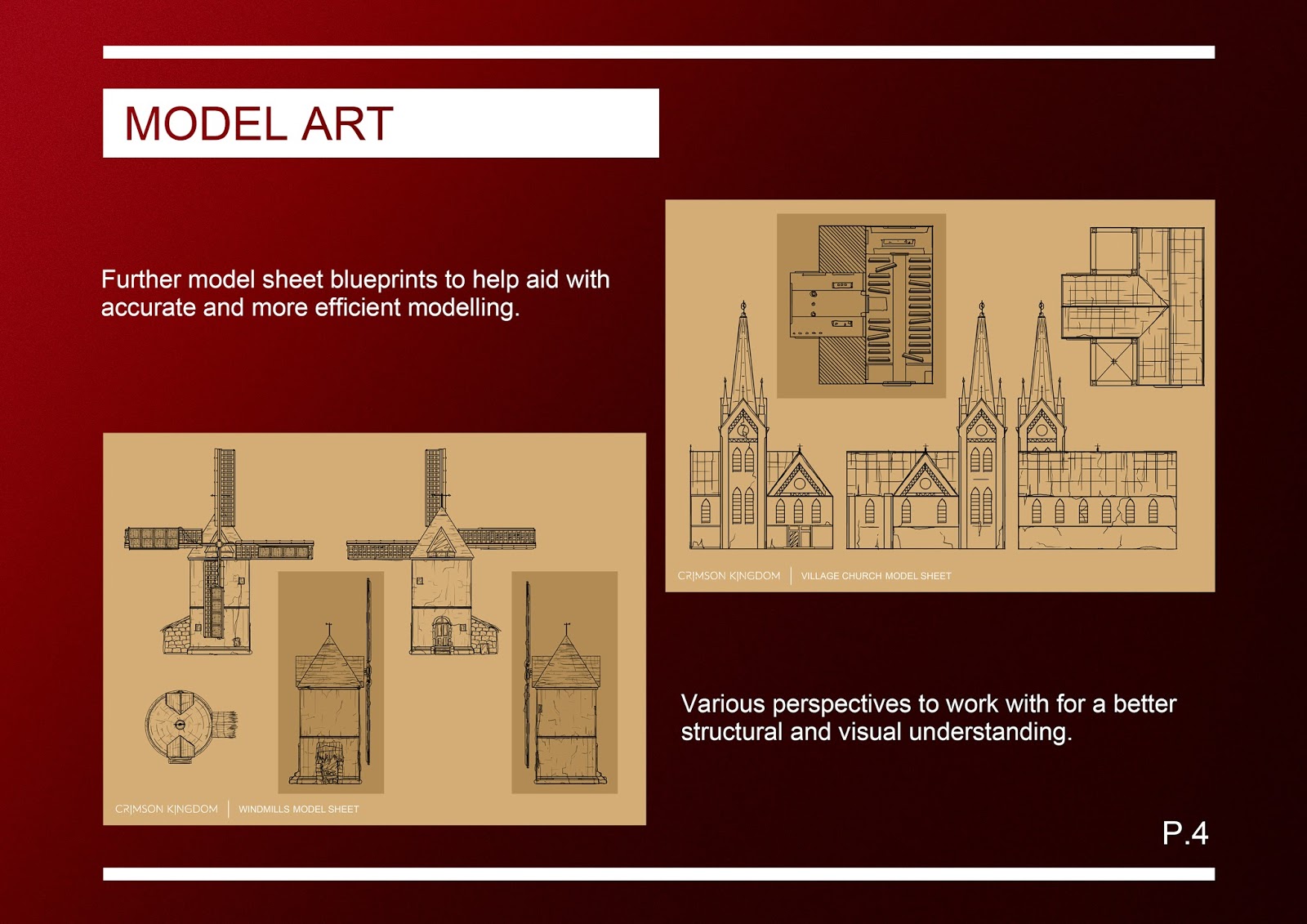
Moving on from the last wave of work, which was mainly 2D model sheets (acting like blueprints) I had a mixture of tasks to complete in 2D and 3D. Part of my role as concept artist in our team is to fix and problem-solve several aspects. For example, aspects from dimensions, to placement of assets and even to how the player may navigate to certain areas more than others in the world (and how that effects narrative).
The image before the above is an early mock-up of how I was going to create a 3D orbiting planetary system using Maya's shatter effect tool. In our game, time and space has been completely distorted. This gave us the opportunity to create some interesting atmospheres and horizons scattered with planets (usually distant in our solar system) up close and/or even destroyed from all the violent gravity centres colliding.

I had a theory behind how to create the planets in the sky of our game with the atmosphere as daytime (our layered atmosphere allows only the reflection of light from the sun of neighbouring bodies through). However, due to time constraints and no clear tutorial, I was unable to create 3D planet models that may have had a transparent spherical PNG file on them giving the same effect. The image I made before the above screenshot is of the eight planets/moons that are visible in our games sky (a destroyed Moon, Saturn, Europa, Titan, Dione and a destroyed Enceladus). I decided on making a HDRI image as it was slightly less challenging than 3D and also lighter on the system in terms of rendering etc.

Above and before this step by step is how I went about generating and distorting the flat planet images to a HDRI image. We used a HDRI (basically a 360 photograph panorama to be used as a skybox) that was free online from No Emotion HDRS (also already part of the Unity Adam package). The whole procedure was very time consuming and tricky to keep on editing. I learnt a fair bit about how a panorama distorts an image by using cubemap conversion in a Unity test project and felt my independent learning improved greatly on this. Another great aid was a HDR teaching guide from the site Adaptive Samples and how the powerful file format worked.
The next huge and unexpected task was on a model of the Golden Gate Bridge I did when we first began the final major project the previous year. When I finished construction on the model I had done a very weak job on the UV's and in some parts not at all. I made sure to make multiple saves but this was in Maya 2016. When I opened the file in 2017's version of Maya, the model in the scene was a complete mess (see above). Somewhere along the transition between the two versions, the file must have got reset in places. In addition, I had also done a lot of mirroring which seemed to have not retained any information from Maya 2016.
A part of a professional practice is to see this problem and try to work around it to the best of my ability (instead of giving up and bailing overboard). The first thing I did was go back to a previous save and find parts I could export and import into the scene then mirror again (such as the central tower sides).
After that lengthy challenge, I then decided to move on to the other highly time consuming task of UV unwrapping. Here I have, to the best of my ability, planar and automatic unwrapped a lamppost on the bridge model and then laied the UV's out cleanly.
I felt the original model was slightly rushed and not thought out as thoroughly as possible. For example, the sheer volume of polys that would most definitely weigh down and decrease the games frame rate had we put it in game. Alongside organizing my workflow in the hierarchy, I went bit by bit tweaking and editing then going over and working on the UV's. Here I aligned by 180 degrees one of the new barriers over an old one at the base of the left tower arm.

One of the best examples of editing parts of the old model's polys, was the main cables on either side of the original suspension bridge tower. The before unedited cable was just under thirty-seven thousand polys; whereas after editing down the edges and edge loops, I got it to about six and a half thousand. This vastly extreme difference is mainly due to me working in a 'perfection haze'. If this model was to be made for rendering in film, then it would be great but there is a strict workflow/practice for game builds I have recently been learning of. The larger the map/scale of a game world, the more strain you put on the running system. Having a lower poly model helps this drastically.

Another issue I came up against (this area of working was rather strenuous thats for sure!) was scaling of UV's. Confining the UV's to the grid in the UV editor actually stops the quality of model textures the larger you go. One of the Golden Gate Bridge towers is roughly one hundred and fifty two meters high (from the bridge road to the top)! In the game's world space, that texture would also only be so large before the quality drops from that map. In order to help this, the layout can be set to 'legacy' which assigns the UV's to the scale of the model (so quite large!). I did this for a few parts of the model before I found out about tileable texturing with maps (our Game Designer making the end texture for the bridge for the game due to time constraints).
Above is one of the procedures in unwrapping a pipe by giving it a seam. I got fairly used to the technique, as there are over forty eight of them on the model itself!
Some of the automatic unwrapping on parts of the model didn't go to plan and I had to manually use planar mapping as seen above.
After what seemed like a very tiresome job it was highly satisfying seeing the end result when we got it in-engine. Furthermore, our Game Designer went over the model and tweaked it slightly to enable LOD's (Level Of Detail) which helps again with the game optimization.
Here's a low angle perspective roughly to how the player would see the model in game. I am very pleased with the end result, even though it was a very very challenging build; I have come away more experienced and better off for it. Hard work does pay off!
A 2K render I did using NVIDIA mental ray in Maya and simple matched colour materials. I set up a small turntable base as well for a clear presentation of the model.
A part of a professional practice towards a game is high-quality polished work. Aiming towards this, I made most of our game UI and 2D (in-game) elements using Adobe Illustrator. I could then work using vectors and produce crisp high quality images. Above is a dove silhouette I created using a photograph for reference for a shadow puzzle in our game.
Here I created a simple controls screen that will go in our games main menu.
The original logo we used for our games identity was slightly hard to read due to the thinness and texture of the text. I decided to create our own logo using Illustrator; following roughly that of the original font but making the new one our own.
In addition to the logo and UI for the menu I made several elements for the in-game menu such as these pick-up icons that change colour on the menu after the player has picked them up.
The original digital concepts I made for each before I worked on top of them.
In the game, there are several houses and establishments in the village area. Our Game Designer asked if I could generate some ideas and then logos of things like tailors and blacksmith signs (from different periods in time of course) that would go up on top of the model signs textures as PNG's. I enjoyed making various hand-drawn logos as well as ones that have been ripped off of objects from across time.
The next job to do was to create a model of the Chichen Itza step-pyramid called El Castillo that would go in our game. Above is early construction, using my blueprint model sheets for reference guides. One of the tricky parts of this model is the pyramid has steps extruding from each of the four sides. I ended up completely deleting the faces where the steps would be and modelled them into to place.
Here is the high poly steps refined and reduced on as many polys where possible.
Above is a breakdown of the main stages of building the pyramid. I had a lot of fun overall constructing in the problem-free scene!
I dropped the high poly into ZBrush and textured using the noise decayed rock texture and a few other techniques I learnt as I went.
I was fairly pleased with the process working between software's. Here I increased the subdivisions and added in some hard edges on the corners that had smoothed slightly in the process.
Our Game Designer was very helpful giving me aid in a speedy UV unwrap of the two parts before baking.
Once the baked maps were finished using xNormals, I used Quixel to texture the Mayan landmark. I experimented about in Quixel for this model using a variety of textures, sampling tones from references of the actual pyramid as well as building up manually using the paint material tool with a variety of custom brushes harnessing Photoshop.
Here is a render of the final model I made using Quixel.
Another angle and lit render of the pyramid in Quixel. Although I could have spent a lot more time on it as well as create alphas for the individual rock/bricks etc, I am quite pleased with the whole process as a whole.
After rediscovering an artist named Robh Ruppel, recommenced to me by a lecturer, I wanted to style and shape a concept following his workflow starting off very similar to the technique Notan (a Japanese term to describe an important element of design involving light versus dark). Notan means the harmony between light and dark and contrasts in shape; as well as used to form a balance in a paintings general composition. Above is a step by step of the process for one of my concept pieces (starting from simple Notan blocked out forms to the final product).

I struggled to find the right tones for this particular composition (especially around the sky and sea). I decided to tweak these values I established at the start of working with the Notan technique and then looked at various reference images and tutorials on matching colour and its depth in the atmosphere etc. I'm fairly happy with this piece's end result and as it's the first time I followed Robh Ruppel's technique closely, the more I take the method into practice the quicker and easier it will be.
I aimed to follow Ruppel's technique, making several more pieces with various methods of layering elements together (but always beginning with the blocked shape Notan like Ruppel's technique). Above is a concept piece I made towards our games' intro animation where of a Boeing plane teleport into the world via a void portal.

Here is another piece I made. I wanted to fill a lot of negative space in the foreground and highlight the remains of the Stonehenge arch clearly for the audience to read. After asking a fair amount of fellow students, I found out that it was indeed easy enough to recognize! I had fun experimenting with tones on this piece and found things like the grass and trees simple enough to generate. On the other hand, I did find the background wall shape and tone hard to depict as the size of the pathway and framing of the composition was tricky in a telephoto perspective. I rectified this by using basic shapes for scaling and also played around with the exposure tool in Photoshop.

For this painting, I originally wanted to depict just the windmills and the horizon of the sea. Instead, after a little hue mixing error, I focused on exploring the spirit character walking in our game (from a third person perspective, like the player would see). If I had a bit more time I would tweak the clouds in the sky as they seem a little weak in texture; although, the foreground counteracts this such as the grassland and shadows.

With this painting, I chose to show a path in the village area of Crimson Kingdom leading to a void portal. I aimed at working in a very similar format to the Notan and Ruppel techniques while adding a bit more detail to things like the foreground bushes and variations in the three tone values. I enjoyed placing in the flat shadows which act mainly to show the angle of the sun but also show the depth of the image leading (and sort of force) the viewer's eyes down the path to the void portal. While trying to make the doorway to the alternate reality in our game seem alien and not of this world, at the same time, I placed the portal slightly hovering above the ground to give a sense of surreal and otherworldliness.